


Have you ever downloaded a new app and thought,
“Wait… I already know how to use this.”
You didn’t read a tutorial.
You didn’t watch a YouTube video.
You didn’t even ask anyone for help.
Yet somehow, within a few minutes, you already knew where to find the settings, how to go back, where the search bar was, and which button to press next.
It’s almost like you’ve used the app before.
Except… you haven’t.
Now think about some of the apps you use every day.
Your banking app.
Your food delivery app.
Your ride-hailing app.
Your music app.
Your favourite shopping app.
Even AI tools.
Although they all do completely different things, many of them feel surprisingly familiar.
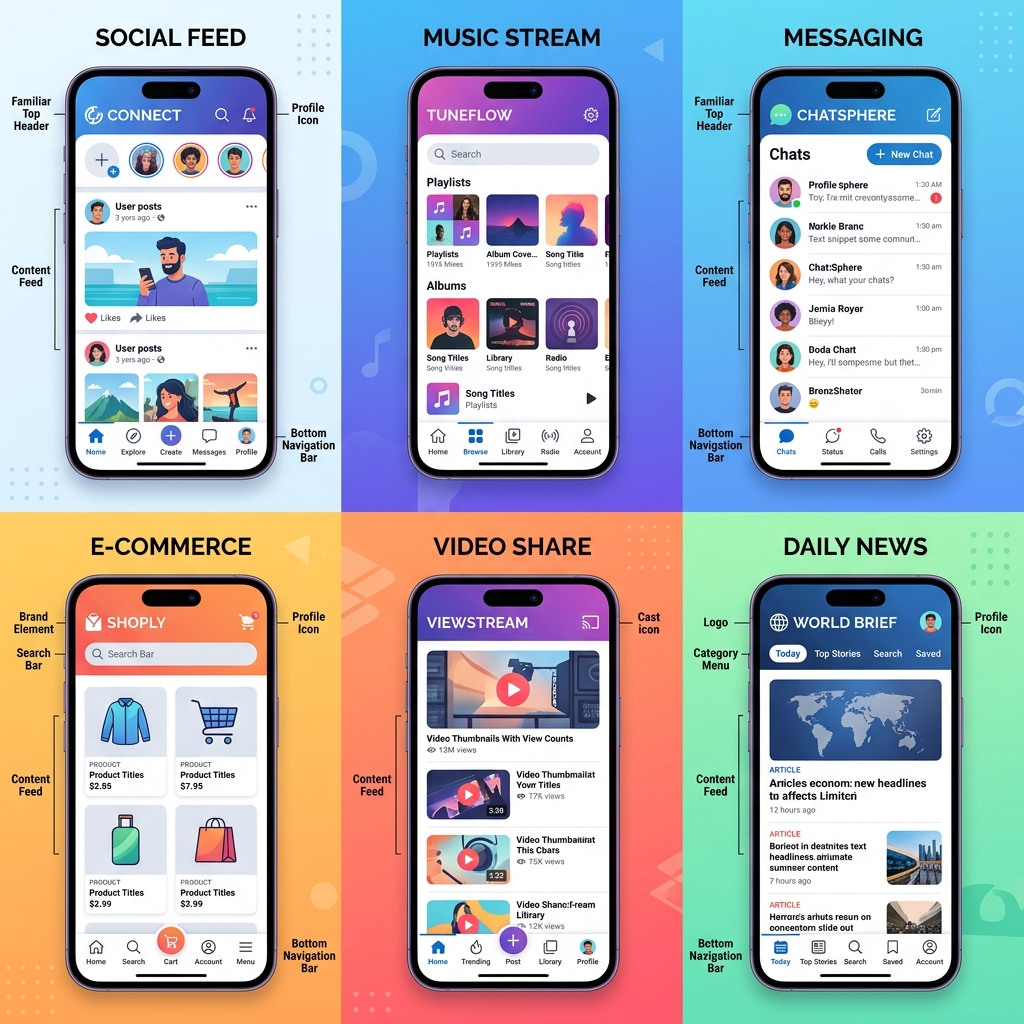
The menus are in similar places.
The icons look alike.
The buttons behave in almost the same way.
At first glance, it might seem like companies are copying each other.
In some cases, they are.
But not for the reason you might think.
They’re doing it because familiarity makes life easier for you.
Imagine Every Car Worked Differently
Let’s do a quick thought experiment.
Imagine renting a car every week.
In one car, the brake pedal is on the left.
In another, it’s on the far right.
One car uses a steering wheel.
Another uses a joystick.
The indicator is behind the wheel in one car but on the roof in another.
Driving would become exhausting.
Not because driving is difficult.
But because you’d have to relearn everything every single time.
Apps face the same challenge.
If every company invented completely new ways for people to navigate, users would spend more time feeling confused than getting things done.
That’s why many apps follow familiar design patterns.
Once you’ve learned one, you’ve unknowingly learned part of the next one, too.
Good Design Often Goes Unnoticed
Here’s something interesting.
People rarely compliment an app because it was easy to use.
Instead, they notice when it isn’t.
Think about the last time you couldn’t find the checkout button while shopping online.
Or when an app kept hiding a feature you needed.
Or when you couldn’t figure out how to cancel a subscription.
Frustrating, wasn’t it?
Now compare that with the hundreds of apps you’ve opened without even thinking about how to use them.
That’s good design.
It quietly gets out of your way.
In fact, one of the biggest compliments a designer can receive is that nobody notices the design at all.
Because it simply works.
Your Brain Loves Familiar Patterns
Have you ever rearranged the furniture in your house?
For the first few days, you probably reached for a light switch that wasn’t where you expected.
Or walked toward a chair that had been moved.
Your brain had already memorized the old layout.
Apps work the same way.
After years of using smartphones, our brains have developed certain expectations.
Search icons usually look like magnifying glasses.
Shopping carts have trolley icons.
The profile icon often sits in the top or bottom corner.
Settings usually have a gear symbol.
When designers follow these familiar patterns, users don’t have to stop and think.
They simply interact.
That tiny reduction in mental effort makes an app feel smooth and intuitive.
Why Companies Test the Smallest Details
It might surprise you to know that companies don’t just wake up and decide where a button should go.
Sometimes they’ll test two versions of the same screen.
In one version, the “Buy Now” button is blue.
In another, it’s green.
Thousands of users interact with both versions.
The company studies which one people find easier to use.
The same thing happens with:
Button placement.
Navigation menus.
Font sizes.
Icons.
Colours.
Even the wording on a single button.
It may seem like a tiny change.
But when millions of people use an app every day, even a small improvement can make a huge difference.

Why Did They Change It? It Was Fine Before!
We’ve all said it.
A favourite app updates.
Suddenly, the menu has moved.
The icons look different.
Everything feels unfamiliar.
The first reaction is usually frustration.
“Who asked for this?”
Interestingly, companies expect that reaction.
Because change—even positive change—takes time to get used to.
Sometimes updates really do improve the experience.
Other times, companies are preparing for future features.
And occasionally…
They simply get it wrong.
Not every redesign is a success.
That’s why companies constantly collect feedback and make adjustments after launching new versions.
The apps you use are rarely “finished.”
They’re continuously evolving.
Looking Similar Doesn’t Mean Lacking Creativity
Some people assume that if apps share similar layouts, designers aren’t being creative.
The opposite is often true.
Imagine visiting an airport where every sign used completely different symbols.
Finding your gate would become unnecessarily difficult.
Consistency isn’t boring.
It’s helpful.
Great designers know when to be creative and when to stay familiar.
The creativity often happens behind the scenes.
In the animations.
The interactions.
The tiny details that make an experience feel effortless.
Sometimes the smartest design decision is choosing not to reinvent something people already understand.
The Best Apps Make You Forget About the App
This might sound strange, but hear me out.
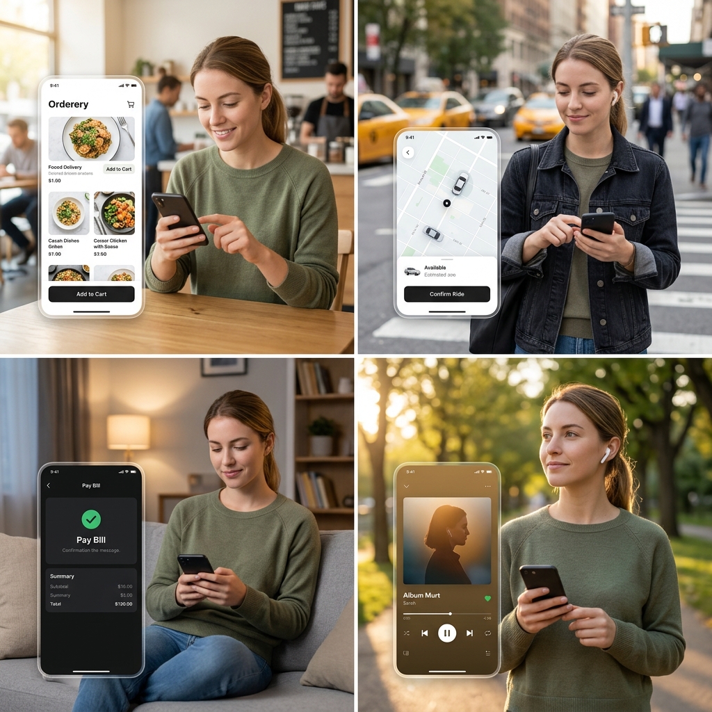
Think about ordering food online.
Your goal isn’t to admire the app.
Your goal is to order dinner.
Or booking a ride.
Your goal isn’t to appreciate beautiful buttons.
It’s getting from one place to another.
The best apps quietly disappear into the background.
They remove obstacles.
Reduce confusion.
And help you complete your task with as little effort as possible.
When technology feels invisible, it’s usually doing its job well.
Final Thoughts: Familiar Doesn’t Mean Unoriginal
The next time you download a new app and instinctively know where everything is, take a second to appreciate what’s happening behind the scenes.
That feeling isn’t accidental.
It’s the result of years of research, testing, user feedback, and thoughtful design decisions.
The goal was never to make every app look identical.
The goal was to make every app feel familiar enough that you could focus on what you wanted to do instead of figuring out how to do it.
So yes, many apps look similar.
And that’s perfectly okay.
Because good technology isn’t always the one with the flashiest design.
Sometimes it’s the one that quietly stays out of your way, making your life just a little bit easier without you ever noticing.
And when that happens, it’s not a lack of creativity.
It’s a great design doing exactly what it was meant to do.

